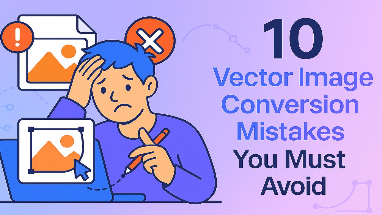
Converting photos to vector graphics is a critical skill for designers, illustrators, and anyone working in digital or print media. Vector files offer unmatched scalability, precision, and flexibility—but achieving a clean, professional result requires more than just clicking “Image Trace.” Small mistakes in the conversion process can lead to distorted paths, poor print quality, or unusable files. In this guide, we’ll walk through the top 10 Vector Image Conversion Mistakes, so you can improve your workflow, enhance output quality, and save time on revisions. And if you are looking for fast and reliable image vectorization service provider contact us and get a free quote today.
What are the common mistakes to avoid for photo to vector conversion?
1. Using Raster Instead of Vector Graphics
One of the most common mistakes when converting photos to vector is not understanding the difference between raster and vector formats—and using raster graphics where vectors are required.
Raster images (like JPG, PNG, or BMP) are made up of pixels. They lose clarity when resized and are not ideal for tasks requiring scalability or detailed editing. In contrast, vector graphics use mathematical paths, curves, and points, allowing them to scale up or down infinitely without any quality loss.
Using a raster image when a vector is needed leads to:
- Pixelated output when resized
- Limited editability
- Incompatibility with printing or laser cutting
Tip: Always convert your raster images to vector format before using them in designs that require scalability, such as logos, signage, or technical illustrations.
2. Ignoring the Importance of High-Quality Source Material
Using a low-resolution, blurry, or poorly scanned image is one of the biggest mistakes in photo to vector conversion. Vector software can only trace what it sees—so if the source image lacks detail or contains noise, the result will be inaccurate or unusable.
Common problems caused by poor source material include:
- Jagged or broken paths
- Inaccurate outlines
- Unwanted artifacts or background elements
To avoid this, always start with a clean, high-resolution photo that has:
- Sharp contrast between subject and background
- No dust, stains, or compression noise
- Clear edges and fine details
Tip: Before importing the photo into Illustrator, CorelDRAW, or Inkscape, consider enhancing brightness and contrast to improve tracing accuracy.
3. Assuming CMYK and RGB Colors Are the Same
One critical but often overlooked mistake in photo to vector conversion is failing to understand the difference between RGB and CMYK color modes. While they may appear similar on screen, they behave very differently in design and print environments.
- RGB (Red, Green, Blue) is used for digital screens and web-based graphics.
- CMYK (Cyan, Magenta, Yellow, Black) is the standard for printing and ensures color accuracy on physical materials.
Using RGB in a file meant for print can result in:
- Color mismatches
- Washed-out tones
- Unexpected results during final output
Tip: Always convert your artwork to CMYK mode if it’s intended for printing. Use tools like Adobe Color or a color inspector to get accurate CMYK values from your digital RGB palette.
4. Over-Simplifying or Over-Complicating the Path Structure
Striking the right balance between detail and simplicity is key when converting a photo to a vector. Many beginners either oversimplify the path structure—losing key details—or overcomplicate it by adding too many anchor points.
Mistakes to avoid include:
- Using too few points, which can make shapes look unnatural or incomplete
- Using too many points, which makes files heavy, harder to edit, and more error-prone
- Creating unnecessary complexity that slows down software performance
Tip: Use your vector software’s path-simplifying tools (like “Simplify Path” in Illustrator) to remove redundant points. Maintain curves and edges only where needed to preserve shape integrity without overloading the file.
5. Using Poor Contrast in the Image Before Tracing
Low contrast between your subject and background can severely impact the accuracy of vector tracing. When there’s not enough visual separation, the software struggles to detect edges—resulting in sloppy paths, missed shapes, or merged elements.
Common issues caused by poor contrast include:
- Blurred outlines or indistinct paths
- Merged or missing components during auto-trace
- Reduced readability in text or intricate areas
Tip: Before converting a photo to vector, enhance contrast using basic image adjustments like brightness, levels, or curves. For web accessibility and visual clarity, you can also test contrast ratios with tools like WebAIM or Adobe Color Contrast Analyzer.
6. Failing to Use Proper Layering Techniques
Layering is essential for organizing complex vector artwork. One common mistake during photo to vector conversion is placing everything on a single layer, which makes the design harder to edit, adjust, or scale later.
Without proper layering, you risk:
- Overlapping elements becoming difficult to separate
- Time-consuming edits when needing to isolate specific areas
- Loss of control over background, foreground, and detailed elements
Tip: Create separate layers for distinct elements such as the background, main subject, text, and shadows. Proper layering improves your workflow, supports non-destructive editing, and simplifies file management.
7. Poor Cropping Before Vectorization
Failing to crop your image properly before vectorization can lead to cluttered designs, irrelevant details, and a lack of focus on the main subject. This mistake not only affects the composition but also increases file complexity unnecessarily.
Consequences of poor cropping include:
- Distracting or unnecessary background elements being traced
- Increased path count, leading to slower rendering
- Misaligned or off-centered focal points in the final vector
Tip: Always crop the photo to highlight the primary subject. Maintain a balanced aspect ratio, center your content, and use built-in cropping tools (like those in Illustrator or Photoshop) to prep the image before vector tracing.
8. Neglecting to Check for Smoothness and Accuracy After Conversion
After converting a photo to vector format, many users skip a critical step—refining the curves and paths. Auto-tracing tools often create jagged, uneven lines or add unnecessary anchor points that can affect both aesthetics and scalability.
Problems caused by neglecting this step include:
- Rough edges that appear unprofessional when zoomed or printed
- Inconsistent curves that deviate from the original image
- Difficulty editing due to excess anchor points
Tip: Use your software’s smoothing or path-editing tools (like the Smooth Tool in Illustrator) to refine outlines. This improves both appearance and usability of the final vector file, especially for detailed illustrations or logos.
9. Not Testing the Scalability of the Vector File
A major advantage of vector graphics is infinite scalability—but many users forget to test their design at multiple sizes before finalizing. Skipping this step can result in graphics that look fine on screen but lose clarity or proportion when resized for print or digital use.
Consequences of not testing scalability include:
- Blurred or broken lines at large sizes (e.g., banners, signs)
- Loss of detail when scaling down for icons or business cards
- Visual imbalance in layout and spacing
Tip: Always preview your vector at both large and small dimensions. Zoom in to check edge smoothness and fine details, then shrink it down to test legibility. This ensures your design is ready for all real-world use cases.
10. Overlooking File Size Optimization
Vector files can become unnecessarily large if they contain too many anchor points, hidden layers, or excessive detail. Ignoring file size optimization slows down performance, complicates sharing, and may even cause printing issues.
Problems caused by large or bloated vector files include:
- Lagging design software during editing
- Longer upload or download times
- Compatibility issues with web platforms or printers
Tip: Simplify paths, remove unused layers or objects, and avoid redundant shapes. Tools like “Simplify Path” (Illustrator) or “Reduce Nodes” (Inkscape) help streamline files without sacrificing visual quality.
How to Avoid These Vector Conversion Mistakes?
Avoiding the most common photo to vector conversion mistakes doesn’t require advanced design skills—it just takes attention to detail and a few best practices. Here’s a quick checklist to help you get it right:
- Start with a clean, high-resolution image
- Use vector-friendly formats like SVG, AI, or EPS
- Test your design at multiple sizes to ensure scalability
- Maintain proper layering for easy editing
- Use CMYK color mode for print projects
- Simplify paths without sacrificing essential detail
- Enhance contrast before tracing
- Crop images thoughtfully to highlight the subject
- Optimize file size to avoid performance issues
- Always preview your final vector on screen and in print layout
Following these steps can dramatically improve the quality and usability of your vector files—saving time, resources, and revision rounds later.
Should You Hire a Professional for Vector Conversion?
If you’re handling critical design projects—especially those for branding, printing, or product manufacturing—hiring a professional for photo to vector conversion is often worth the investment.
Professionals ensure:
- Clean, editable vector paths free of unnecessary complexity
- Color accuracy across both screen and print outputs
- Scalable files optimized for your exact use case
- Quick turnaround times, especially for bulk conversions
- Compatibility across design software and formats
Whether you’re a business owner needing consistent logos or a creative agency working on tight deadlines, outsourcing vector conversion to an experienced service provider can give you sharper results and peace of mind. You can learn how to convert photos to vectors in this detailed guide.
Conclusion
Converting photos to vector graphics can open the door to high-quality, scalable, and versatile designs—if done correctly. But even experienced designers fall into common traps that compromise output, usability, and visual accuracy. From using poor source images and ignoring contrast to skipping scalability checks and overloading path structures, these small mistakes can lead to big problems down the line.
By understanding and avoiding these 10 critical errors, you’ll ensure your vector files are clean, professional, and ready for any application from print to web, signage to digital branding. Take your time, use the right tools, and always review your final vector for quality and scalability before delivery.
Frequently Asked Questions
What is one common problem with using vector images?
One common problem with vector images is their limited ability to represent complex color gradients and photorealistic detail. Unlike raster images, which use pixels to capture subtle tones and shadows, vector graphics rely on paths and shapes defined by mathematical formulas. This makes them perfect for logos, icons, and illustrations—but less ideal for detailed photographs or artwork that requires soft transitions and intricate textures.
What are the disadvantages of vector images?
While vector graphics offer many benefits like scalability and editability, they do have some disadvantages. Vector images can struggle with highly detailed or textured visuals, such as photographs, where pixel-based formats like JPEG or PNG are better suited. Additionally, not all software or web platforms support every vector file format equally, which can lead to compatibility issues. Creating high-quality vector artwork also requires more time and skill compared to editing a basic raster image.
Do vector images lose quality?
No, vector images do not lose quality when resized. This is one of their biggest advantages. Because vectors are made using mathematical equations rather than fixed pixels, they can scale infinitely—whether you’re shrinking them down to fit on a business card or enlarging them for a billboard—without becoming blurry or distorted. This makes them ideal for logos, icons, and any design that requires flexibility across various media.
What are vector-related issues?
Vector-related issues typically arise from incorrect usage or poor conversion techniques. Common problems include overly complex path structures that make files hard to edit, missing details due to low-quality source images, or inaccurate color representation when switching between color modes like RGB and CMYK. Another issue is software compatibility—some vector formats (like AI or EPS) may not open correctly in every design tool or web browser. To avoid these problems, it’s essential to use the right tools, maintain clean layers and paths, and always review your output across intended platforms.